Designing the Sub pages
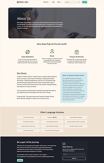
I was tasked with designing several subpages for the Pray As You Go website, including the Donate, About Us, Contact Us, Thank You, Legal and Privacy pages, and later, the Digital Resource page.
A significant portion of our time was dedicated to refining the donation page. Although the previous website already included a donation function, our goal was to expand its scope beyond a simple link and create a more informative and engaging experience. This involved multiple iterations to determine what content should be included on the page and what would be better placed elsewhere. We also explored the challenge of not having an internal donation system. While we ultimately decided to continue using the existing external system, the process initiated important discussions about developing a dedicated in-house solution in the future.
Following the initial website launch, I was assigned to design the Digital Resource page. This page enables users to download and print materials at their convenience. Given the large volume of resources produced over the years, a substantial amount of time was spent auditing and curating content to determine what remained relevant and valuable for inclusion.
Icons were carefully curated to align with the specific needs of each page. I also ensured that the colour scheme and button styles remained consistent with the main page, strengthening overall brand cohesion and visual identity.


Challenges
In addition to the challenges mentioned above, one of the primary difficulties was aligning the designs with the new branding while determining what content should be included on each page. As the website and branding were launched simultaneously, there was limited data on how the audience would respond. As a result, we relied on research into other charity websites, alongside our own experience with the target audience, to guide our design decisions and evaluate their effectiveness. From a user experience perspective, I worked closely with the developer to address design constraints and ensure feasibility. I also incorporated animation thoughtfully to create a smoother and more intuitive user flow.
Another challenge was that several of these pages were entirely new to the brand, leaving us with few existing references to build upon. Many of the proposed features and ideas were also new to the website, which required close collaboration with the administrative team to ensure we could access the necessary data and support the intended functionalities.
Finally, achieving visual consistency through colour matching presented its own challenges. For more complex sections, it often took multiple iterations to strike the right balance between visual appeal and brand coherence. Much like the wireframing process, refining the colour palette required careful testing and adjustment before arriving at the final design.


Result
As a result, the subpages are visually consistent with the new branding, and the overall functionality of the website has been significantly enhanced. Through careful design and planning, we established a strong foundation that supports future updates and scalability. Additionally, this work serves as a valuable reference for future projects, particularly if the brand chooses to evolve its visual identity again.