PAYG Branding 2025
At the outset of the project, I was appointed as the liaison with the company supporting the development of our branding. My role is to represent Pray As You Go and provide strategic oversight, ensuring the direction of the work remains aligned with our core values. I am responsible for guiding the branding team towards an approach that authentically reflects the heart and mission of Pray As You Go.
Developing the Logo
The logo plays a crucial role in communicating the brand, so we knew it was essential to get it right. In our initial meeting, the branding agency presented a series of concepts that strongly referenced Hindu and yoga-inspired aesthetics. As Pray As You Go is a Catholic app, I felt this direction was not appropriate for the brand’s identity.
The agency later returned with several alternative options, though many of these leaned heavily on visual styles reminiscent of other existing brands. After further discussion and refinement, we selected the option shown below, as its design subtly evokes the stained glass windows found in churches—an aesthetic that resonates more authentically with the spiritual heritage and character of Pray As You Go.


Choice of Image
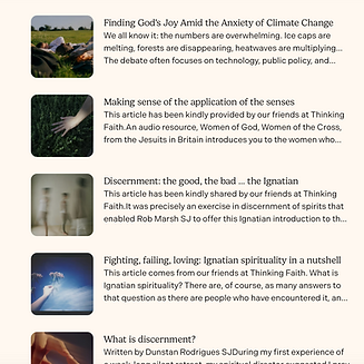
In seeking to foster a stronger sense of community, we shifted our visual direction from a minimalist aesthetic to a more human-centred approach. The initial imagery options provided by the branding agency were limited, so I expanded our visual library by sourcing additional photographs from stock image platforms. To further ensure authenticity and alignment with our brand values, I also purchased a film camera to capture tailored, original images that reflect the spirit and community of Pray As You Go.

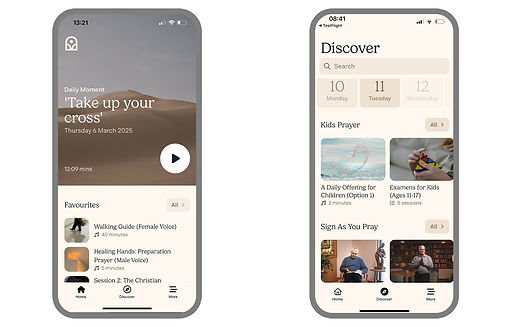

Decision on the colour scheme
The branding team initially presented a proposed colour scheme based on the impression we wanted to convey to our audience. However, we were hesitant about the suggested call-to-action colour, as it did not fully reflect the core values of Pray As You Go. Given our desire to communicate a calm and peaceful brand presence, I refined the colour selection and conducted accessibility testing before presenting the revised option to the team. The outcome was very positive, and we ultimately adopted the adjusted colour scheme.


